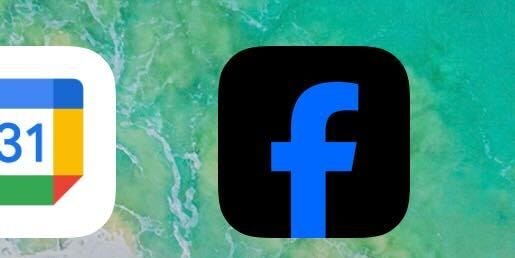
On Thursday, some people noticed something strange and unusual on their phones’ home screens. What was that — that odd black-and-blue “f” icon? That couldn’t be … could it? Facebook?????
Only some people — unclear how many — were affected. I didn’t get the new icon, but my colleague Peter Kafka did. On Reddit’s r/iOS, a place where people care deeply about icon colorways and are very good at identifying minor differences between updates, it was a mixed bag of people who had the black version vs. people with the classic icon.
It turns out, it was just a glitch.
“This was caused by a technical issue and has been resolved. People will see the fix when they update their app,” Dave Arnold, a Meta communications manager, told me.
But for one brief moment, it was fun to imagine that Facebook was taking a daring new turn. After two decades of iconic blue and white, was it shedding its image for something new and darker? All aspects of Meta’s public presentation, from its fonts to its CEO’s new sartorial glow-up, seem open to interpretation of meaning.
Old blue-and-white Facebook was for boomers. New blue-and-black Facebook is winning over Gen Z.
Everyone hated the CEO of the blue-and-white app. Now everyone loves Zuck, the cool surfer running the blue-and-black app.
While the blue-and-white Facebook of 2021 might happily remove COVID misinformation, the new blue-and-black Facebook sends letters to Congress saying Mark Zuckerberg regrets it.
White-and-blue Facebook was merely a social-media company with (debatably) failed metaverse ambitions. New blue-and-black Facebook is competing toe-to-toe — and winning — with Google and Microsoft in the AI race.
Ah, well, I guess it was just a glitch.

